Composition & hierarchy
One clear focal point, a logical reading order, balanced whitespace.
competing focal points, clutter, a buried key message.

I design brands and packaging that sell, dashboards teams actually use and AI visuals that are ready to publish. 13 years for Porsche, Deloitte and Coca-Cola, across Europe, the US, Australia and New Zealand.
I combine strong design fundamentals — composition, typography, colour and hierarchy — with hands-on generative AI. I create, direct and critically evaluate AI imagery and video, and I know when an image is ready to publish.
Three things I deliver, measured across brands, products and dashboards. Click any number to see the project behind it.
Visual AI & content · ORIGAIN, 2026
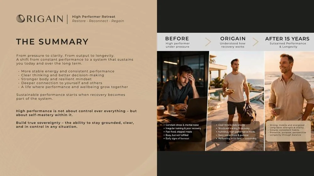
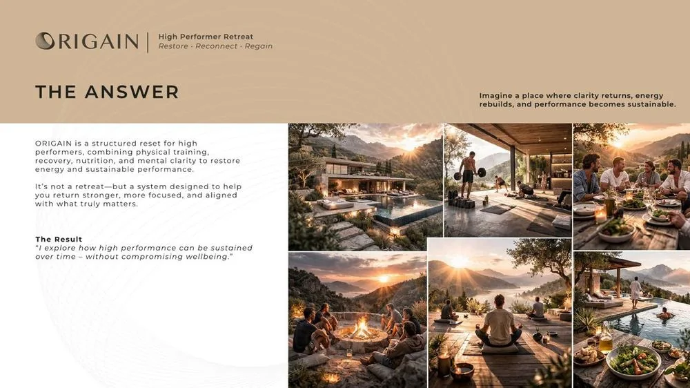
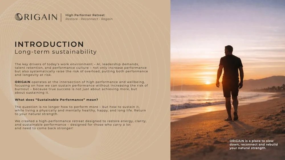
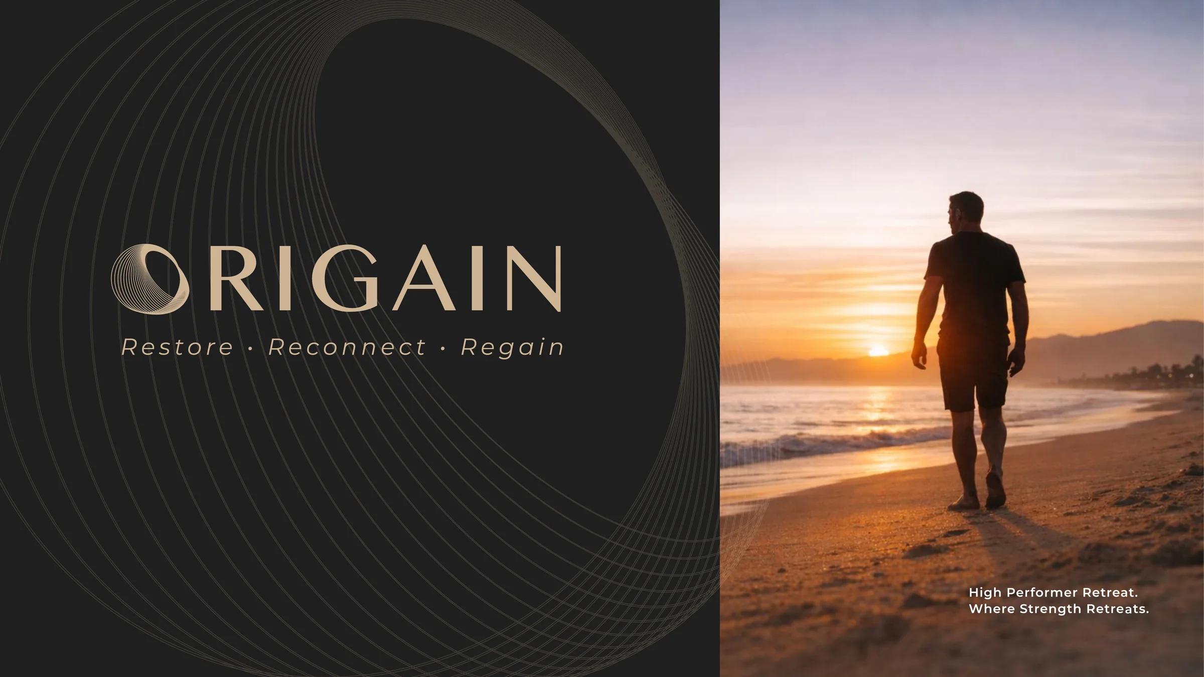
My own high-performer retreat concept, built end to end with generative AI: concept, copy, logo, imagery, brand world and video, edited into a 12-slide pitch deck.
Generating… 0%
 FigmaLayout and pitch deck
Every ORIGAIN asset started as a structured prompt and went through several rounds of direction. Each prompt is built from the same five parts, so changes stay deliberate and results stay comparable.
Directing the image
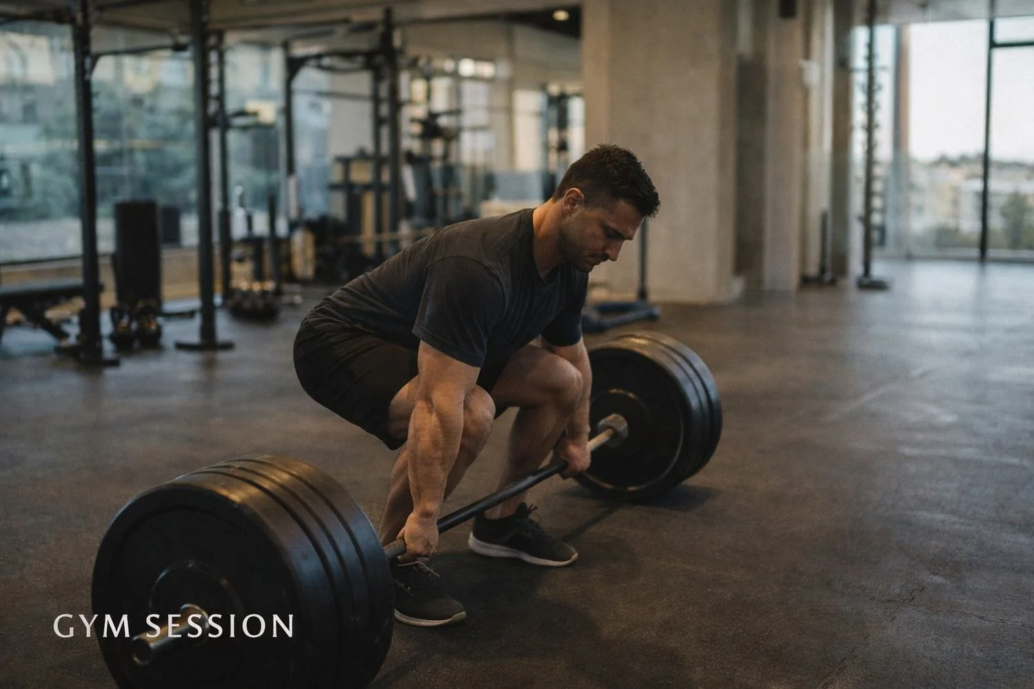
Technically clean, but the story is wrong. An athlete alone with a barbell could be any fitness ad.
DirectionPremium, editorial, golden hour. Result: technically right, story wrong.
Same light, same setting, same athlete. One change, and the image now tells the story of guided, personal training.
DirectionChange one variable only: add a coach. Keep light, setting and athlete.
The opening image of the deck, brought to life as a Runway Gen-4.5 clip and checked frame by frame for motion, anatomy and light.
ReviewFrame by frame for motion, anatomy and light before it went into the deck.
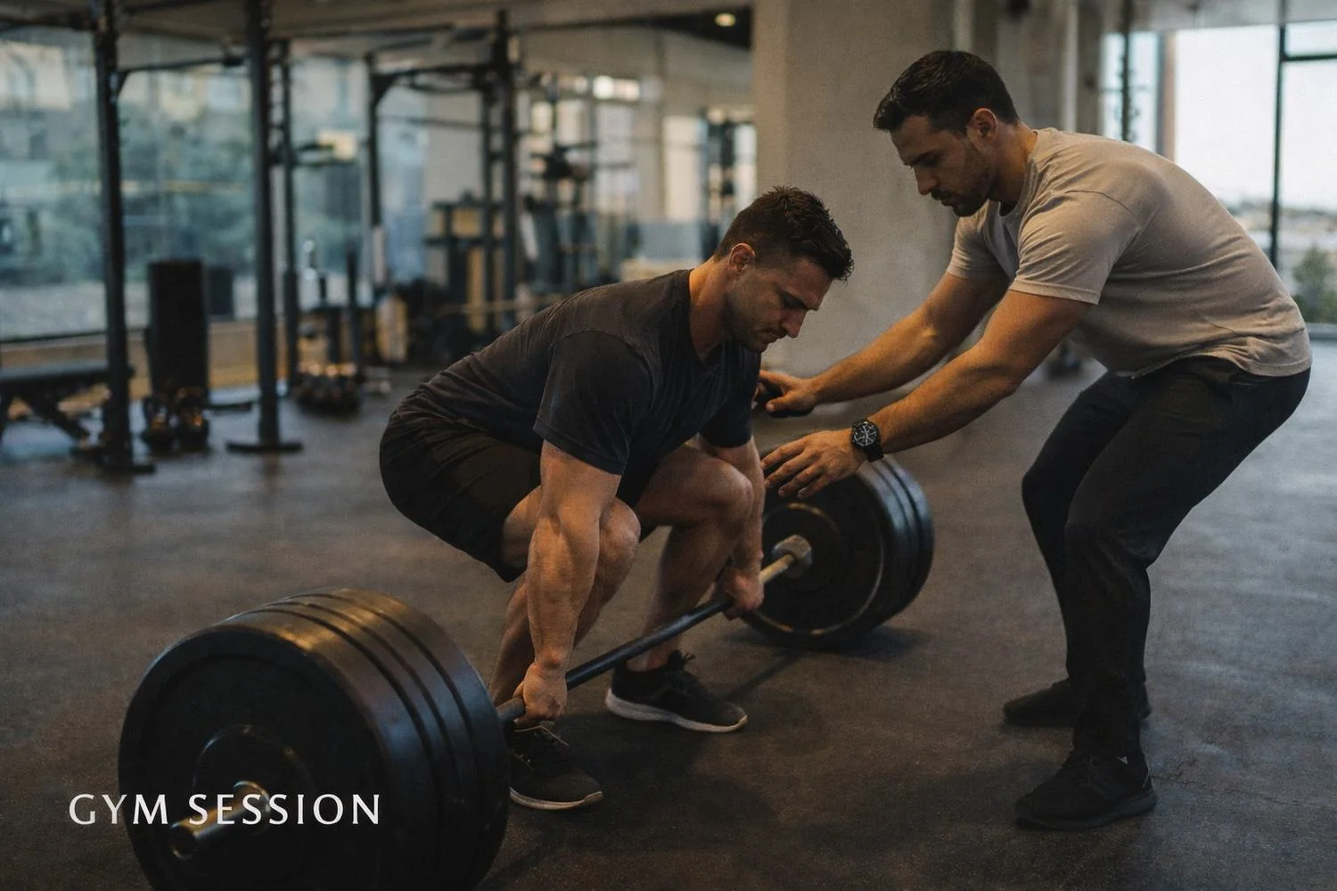 Image, version 1
The retreat, in motion
The full generated shot had a flaw that is easy to miss on a first watch: one guest walks across the surface of the pool. Instead of publishing it, I cropped the clip to a 4:5 social format that keeps the story, the fire, the ocean and the people, and leaves the error out.
12 slides · PDF
Concept, brand world, persona story and the retreat experience, all generated and directed with AI. Happy to walk you through it.
Quality criteria
Six criteria I apply to every review: my own work, my team's, or AI-generated output. I also review copy and cultural fit in German, English and Spanish.
One clear focal point, a logical reading order, balanced whitespace.
competing focal points, clutter, a buried key message.
Legible, correctly spelled text and a consistent type scale.
garbled or misspelled generated text, too many type styles.
A purposeful palette and enough contrast for text to read.
text on busy imagery, low contrast, off-brand hues.
Correct logo use, tone and visual language of the brand.
a generic stock look, distorted logos, inconsistent style.
Readable at the target size, a clear call to action.
tiny copy, weak calls to action, meaning carried by colour alone.
Believable light, materials and product details.
warped packaging, anatomical errors, broken perspective.
Your turnRate this retreat image on three criteria, then compare with my review.
My verdict: strong craft, wrong story. It reads as a gym, not a retreat. Fix: change one variable and add a coach, see version 2 above.
Case study
A self-initiated AG1 key visual. The raw generation had no usable typography, a clumsy crop and broken copy on the pouch. I scored it against my six criteria and rebuilt it step by step. Drag to compare.
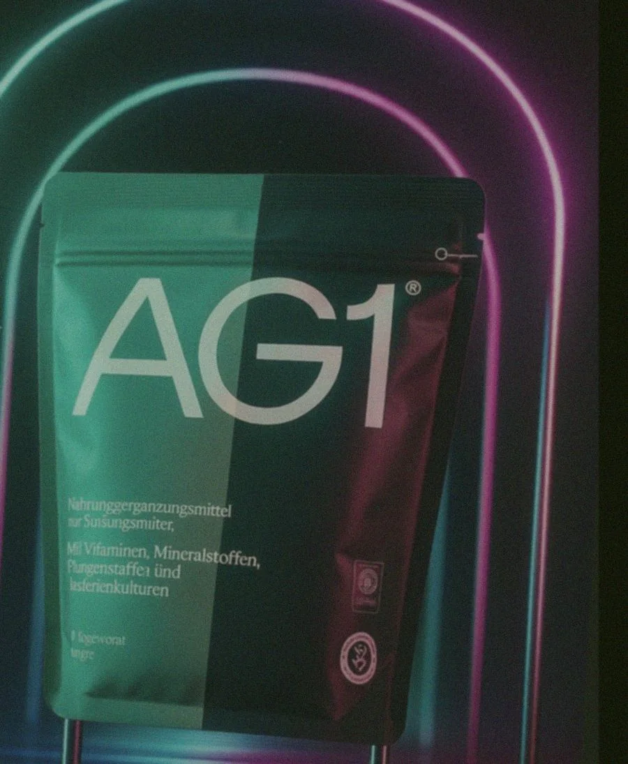
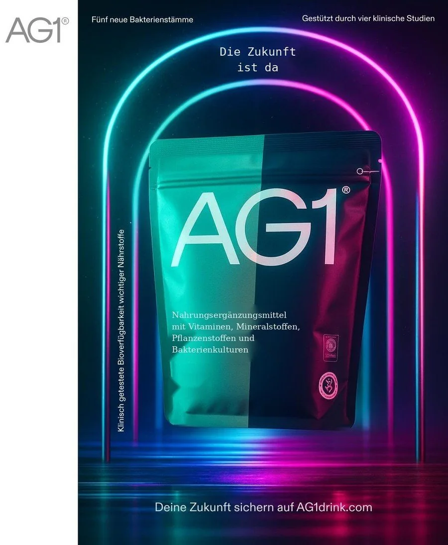 Raw generationFinal
From critique to data
Design critique is only useful to engineers when it is structured. I write every finding twice: once as a designer would say it, once as an annotation with criterion, failure mode, severity and a hypothesis for the cause.
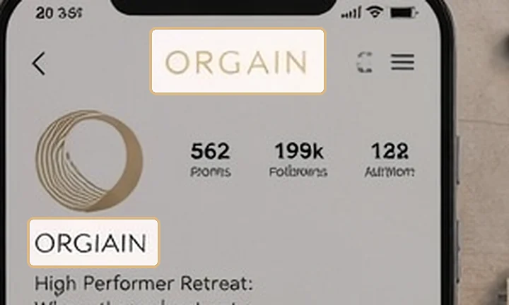
Design critique
The brand name is misspelled as “ORGAIN” in the profile header and under the logo. A reader would not notice at a glance, but it breaks trust the moment they do.
Annotation for the model team
{
  "asset": "origain_social_profile",
  "region_px": [1188, 626, 1292, 666],
  "criterion": "typography",
  "failure_mode": "brand_name_misspelled",
  "severity": "blocking",
  "score": 1,
  "hypothesis": "small-scale text drifts from the prompt string",
  "fix": "render brand text as an overlay; add to eval set as a negative example"
}
Design critique
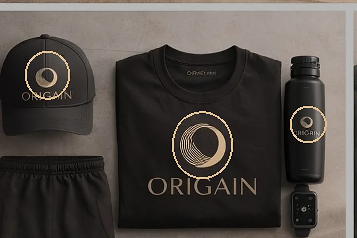
The logo mark is drawn slightly differently on cap, shirt and bottle. Each looks fine alone; together they read as three different brands.
Annotation for the model team
{
  "asset": "origain_merch_set",
  "regions": 3,
  "criterion": "brand_alignment",
  "failure_mode": "logo_inconsistent_across_items",
  "severity": "major",
  "score": 2,
  "hypothesis": "model redraws the mark per object instead of reusing it",
  "fix": "composite one master vector; test consistency across a multi-object prompt"
}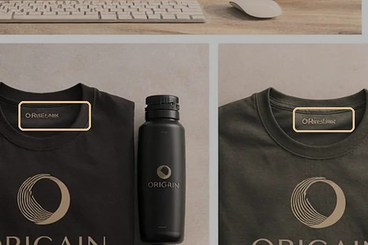
Design critique
Neck labels show illegible pseudo-text instead of the wordmark. Small, but exactly the kind of detail a premium brand gets judged on.
Annotation for the model team
{
  "asset": "origain_merch_set",
  "regions": 2,
  "criterion": "craft_realism",
  "failure_mode": "pseudo_text_on_small_labels",
  "severity": "minor",
  "score": 3,
  "hypothesis": "fine text on fabric below legible resolution",
  "fix": "mask label areas; place the wordmark in post"
}
Style taxonomy
To steer a model, “premium and calm” has to become attributes it can learn. Here is the ORIGAIN opener, broken down. Hover or tap an attribute to see where it lives in the image.
The same attributes become labels for annotation, filters for evaluation sets and building blocks for prompts.
AG1 · Commissioned freelance work
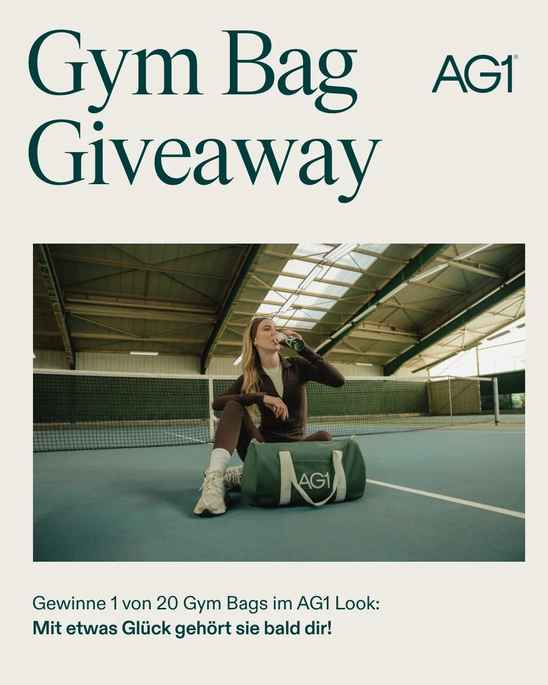
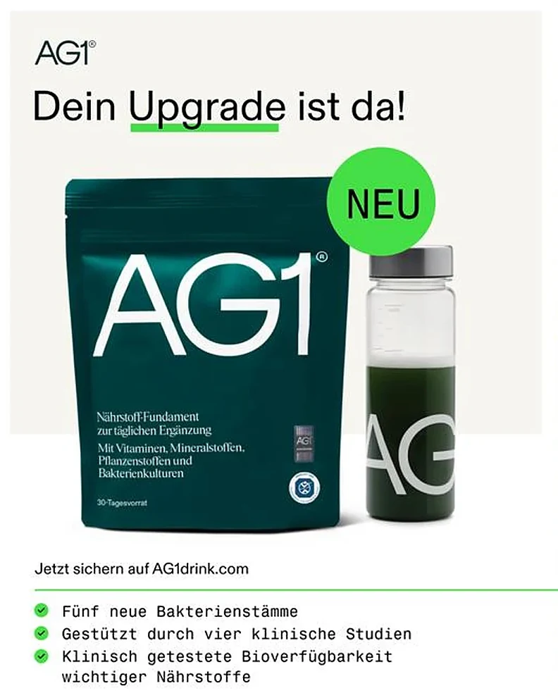
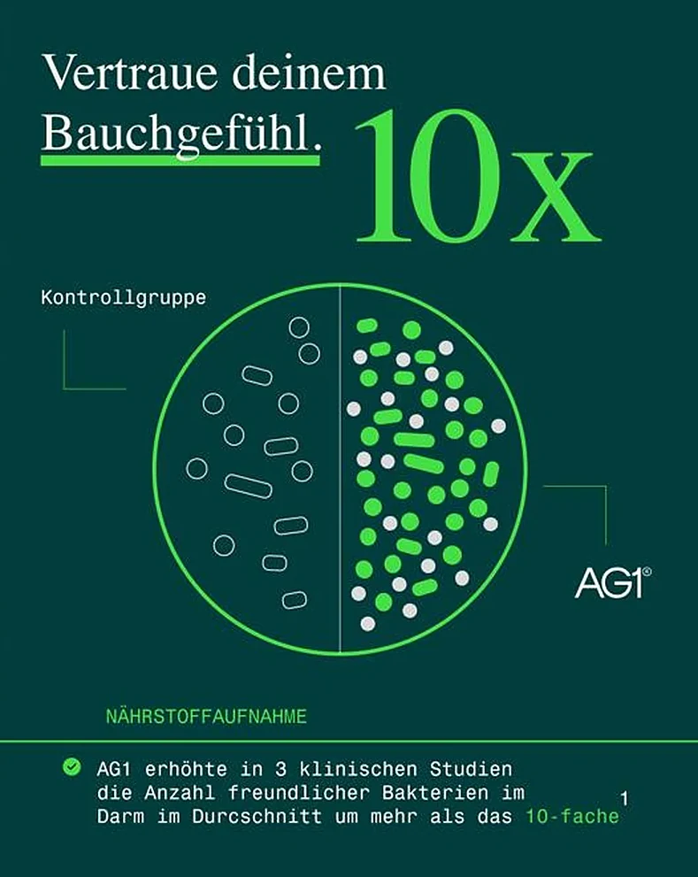
Social media content and merchandise for AG1 in the German market, built with Canva and Figma inside the brand's science-driven system.
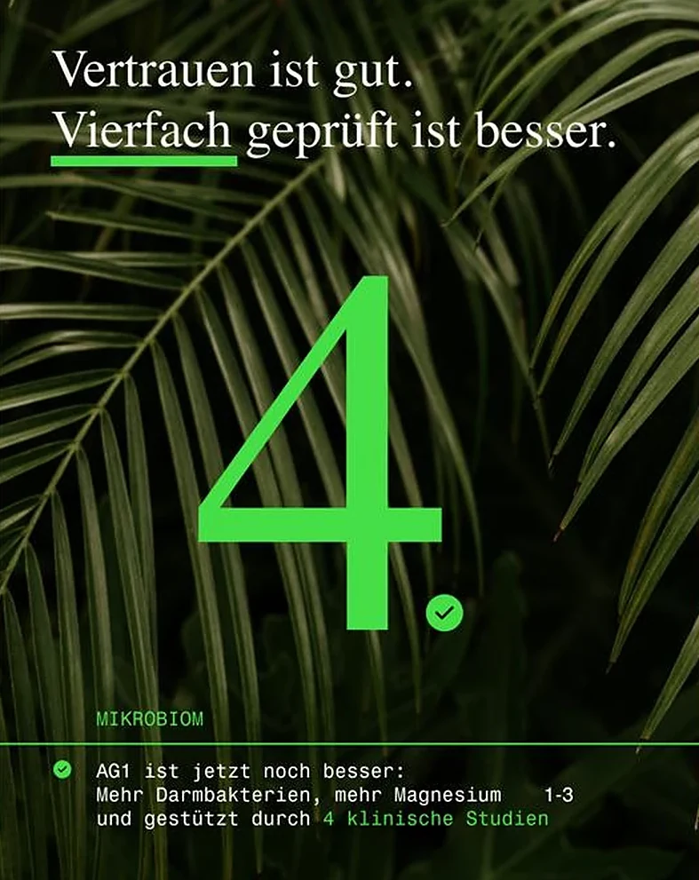
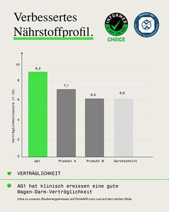
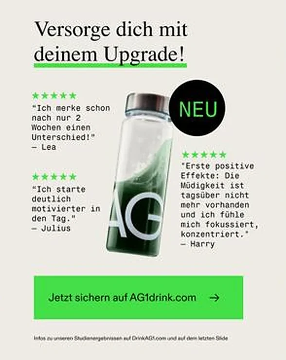
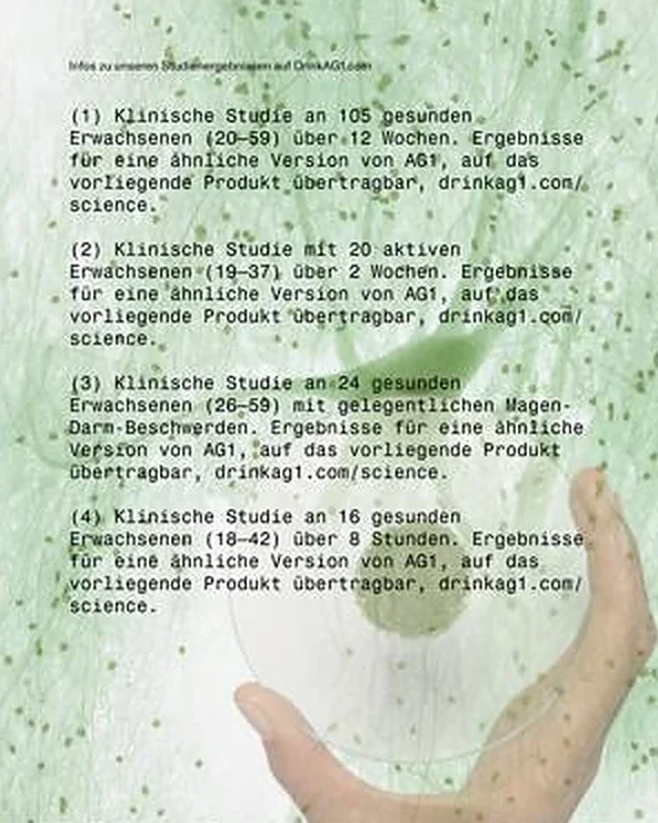
A self-initiated, unpublished carousel for the new formula. Six slides build trust step by step, from announcement to scientific and social proof.
Data visualisation
UI/UX for Power BI dashboards in Germany, the US, Australia and New Zealand. From stakeholder interviews and style guides to trained users who find their numbers faster.
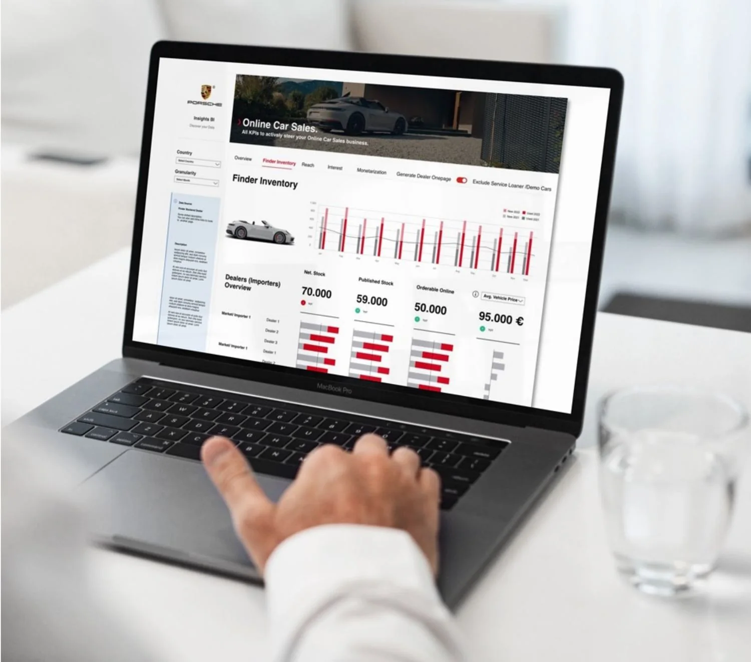
Porsche · Freelance Senior UI/UX Designer, 2021–2023
Redesigned the reporting tools and sales dashboards that track marketing spend, revenue and global KPIs.
Demo data for presentation, under NDA.
Deloitte · Manager, AI & Data · client work under NDA
How I structure design work in complex, multi-stakeholder projects: from prioritised use cases to trained users, with feedback loops designers, developers and business teams can act on.
All use cases captured as tickets and prioritised.
Interviews with the most important users.
Functional design from use cases, interviews and the component library.
The functional design is re-challenged with stakeholders.
Final dashboard; component library extended where needed.
Implementation and training in the regular sprint routine.
Feedback and refinement repeat in an iterative loop until the design is signed off.
Remote design lead for Fusion5 clients in Australia and New Zealand, 2020–2023, plus direct work for EnBW and Porsche. Demo data where under NDA.
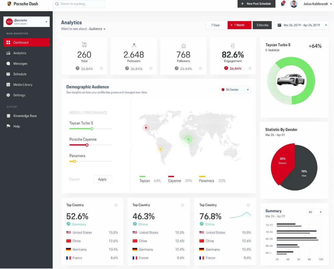
Audience, engagement and model performance in one view: KPI tiles, a world map by model and demographic breakdowns.
Design noteOne screen for audience, engagement and model performance, so the social team sees what drives interest in each model at a glance.
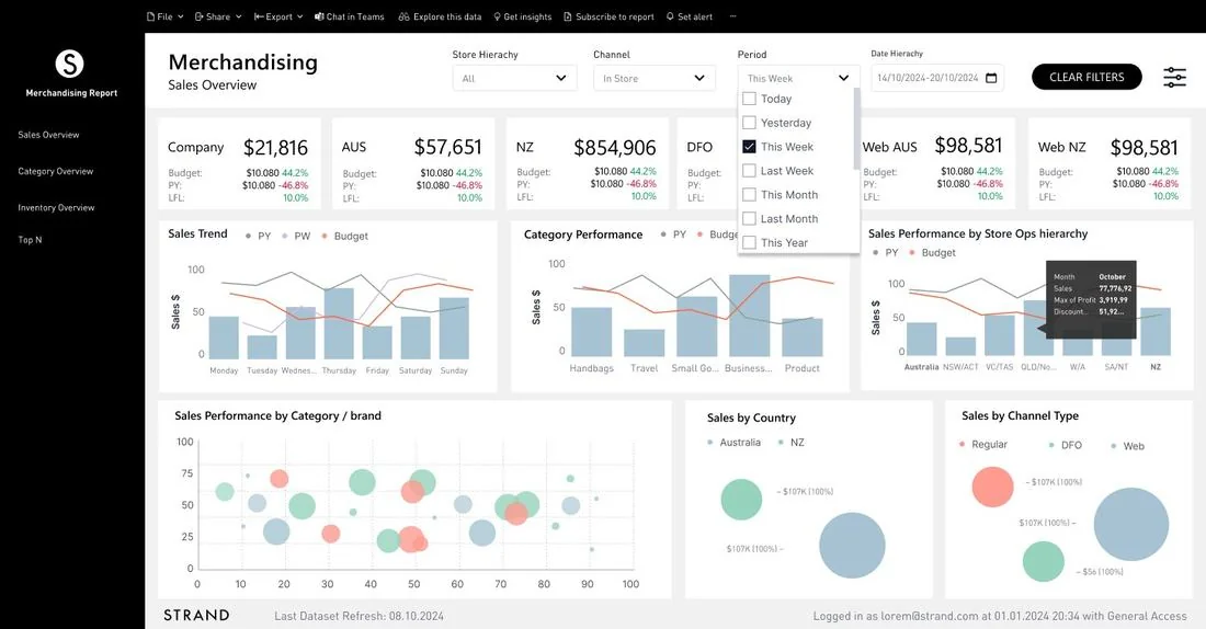
Merchandising report for a bag retailer: sales, category and inventory by store, channel and country.
Design noteSales, category and inventory share one filter logic, so merchandisers switch views without losing context.
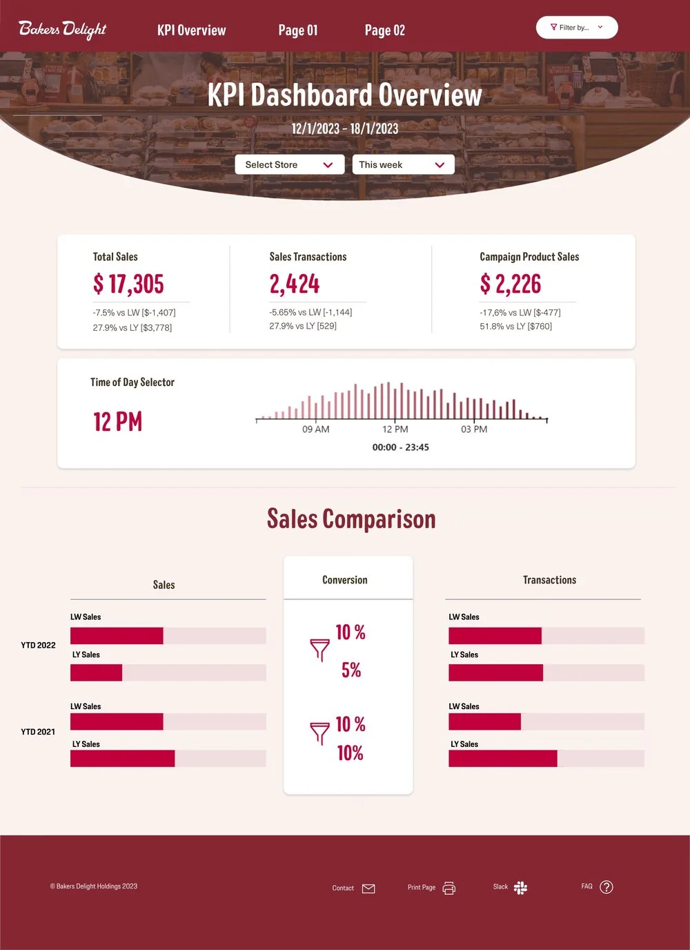
KPI dashboards for a franchise with 700+ bakeries.
“The new and intuitive dashboards save several hours of work, and users find the data much faster.”
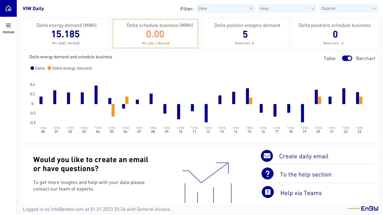
Status quo analysis, UI/UX audit, user interviews and knowledge transfer for energy trading dashboards.
“The new design of the dashboards is perfectly tailored to our needs. The usage rate has increased by 25%.”
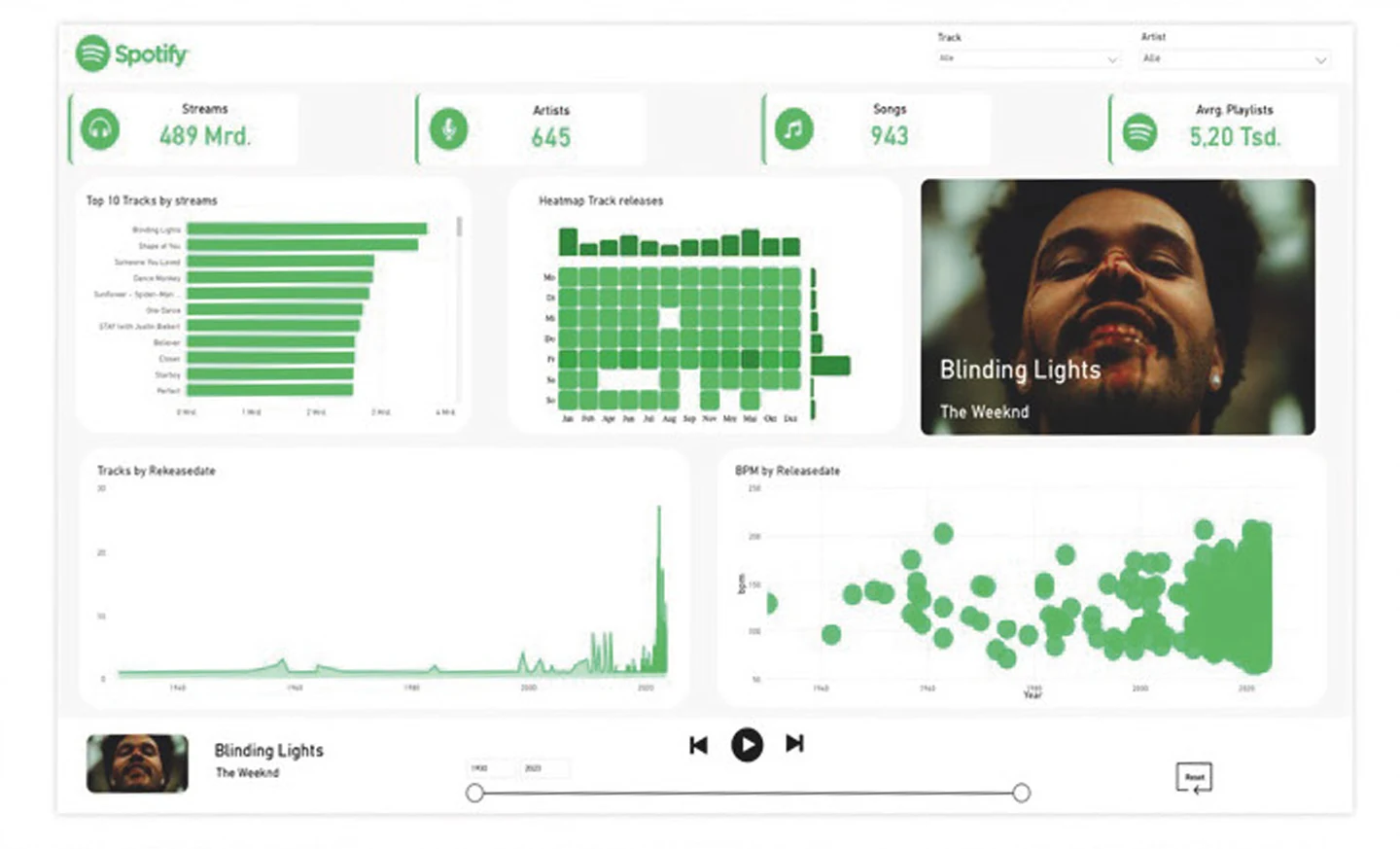
The interface mimics the Spotify player: play controls and the track bar double as page navigation, so exploring the data feels familiar.
Design noteThe player is the navigation. Familiar controls make exploring the data feel like using the app.
Open the live Power BI version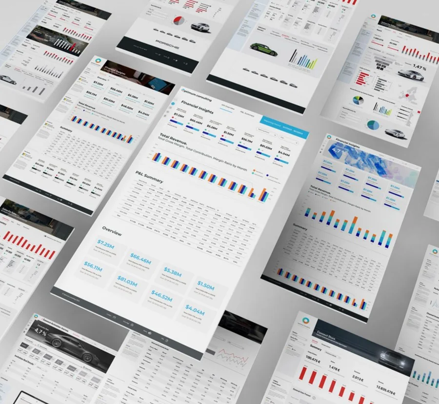
Redesigned and developed Power BI dashboards for the consultancy's clients, with a reusable style guide.
Design noteA reusable styleguide lets the consultancy roll out consistent dashboards to every client, faster.
Let's work together
From stakeholder workshops to a styleguide and trained users. Let's talk about your data.
Return on design
When dashboards are clear and design systems are reusable, people find answers faster and stop rebuilding layouts. That time goes back into their core work. This is how my work raises productivity and the return on every project.
An illustrative estimate. Move the sliders to match a team.
Based on 46 working weeks.
Brand systems · Head of Design / Creative Director, 2016–2019
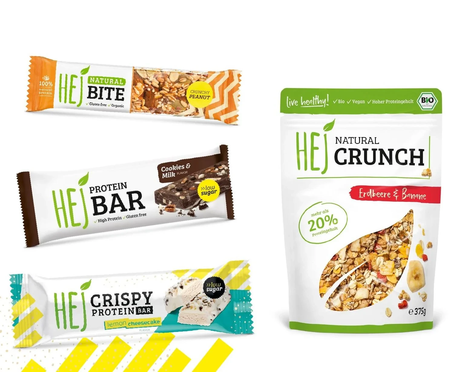
At Goodlife Company I was responsible for the entire brand development of the fitness food brand: identity, packaging, advertising, social media and digital, while leading the in-house design team and external partners.
Hired, trained and led the design team, took part in company-wide decisions on policy and strategy, and directed the TV spot. HEJ ranked among the top 3 fastest-growing German food companies.
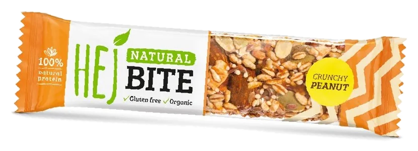
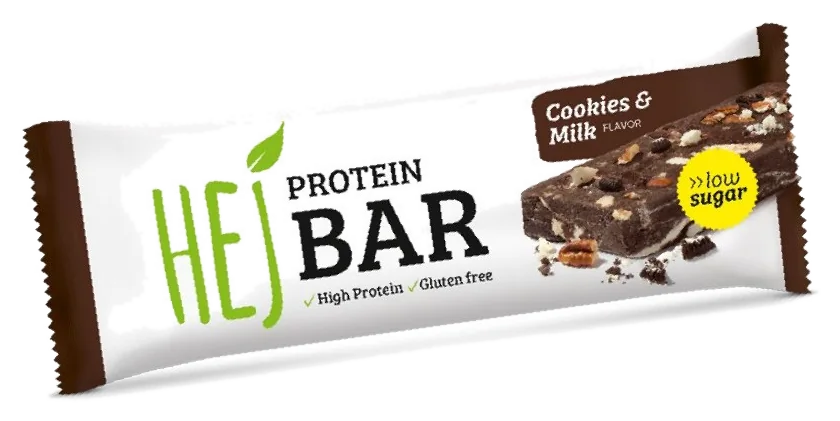
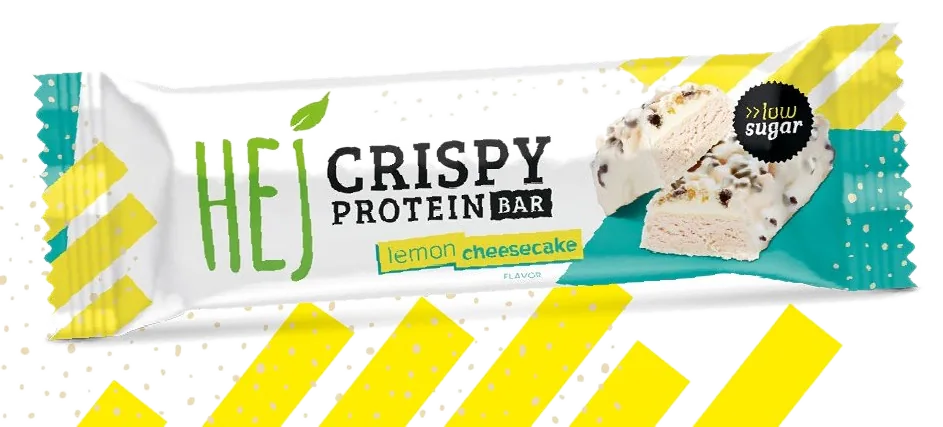
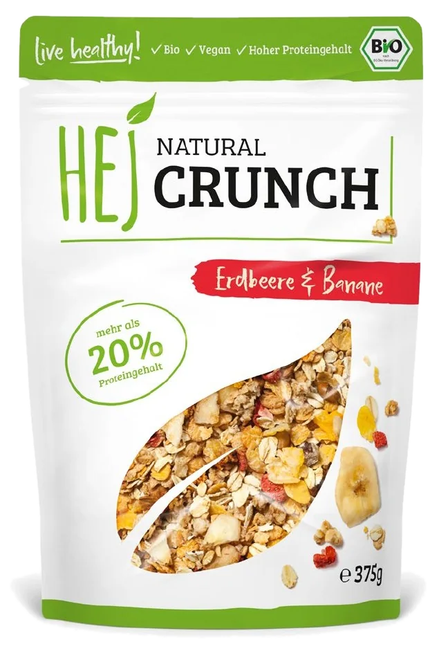
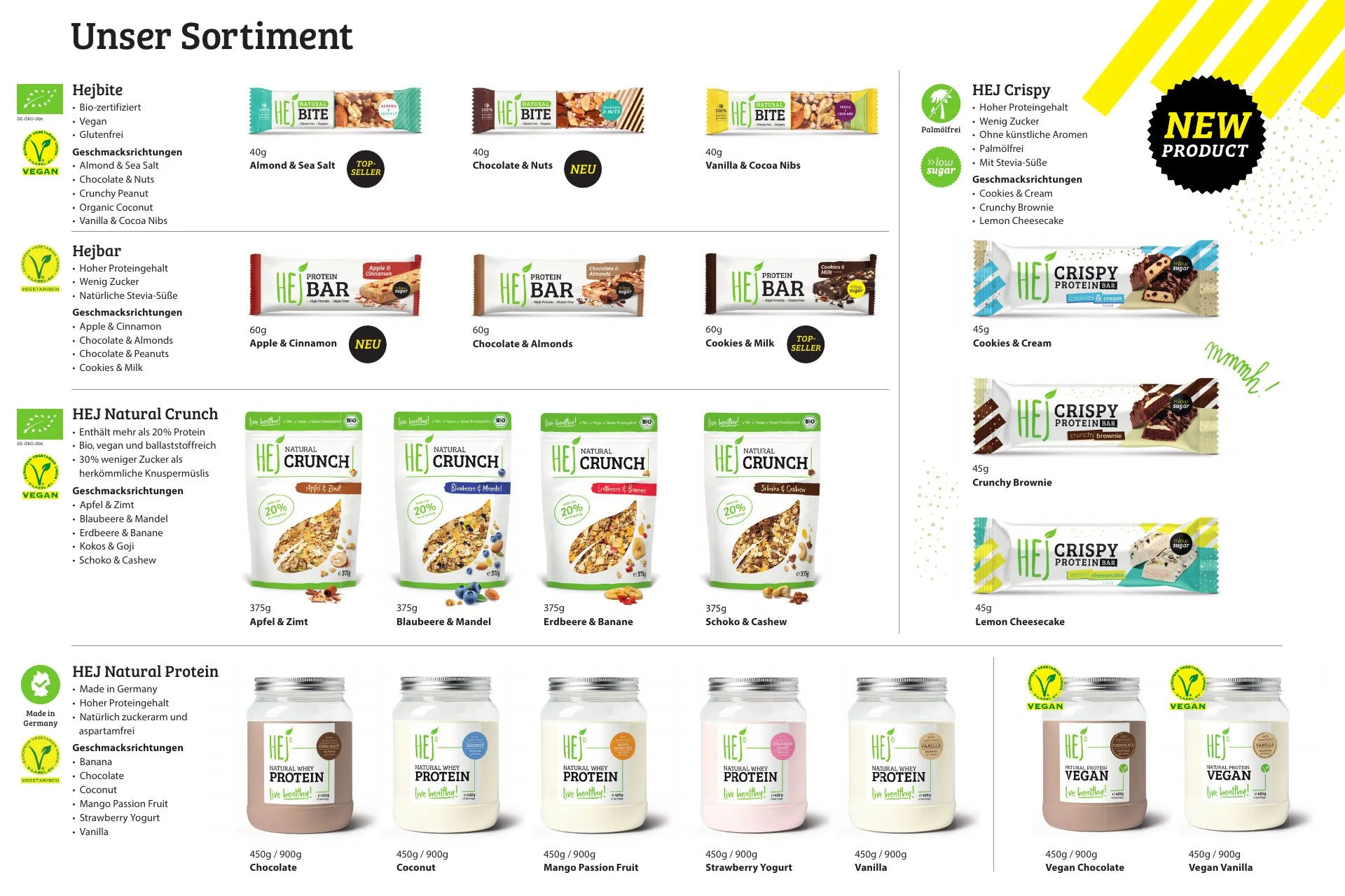
Logo, product-name typography and layout stay fixed; colour and imagery change with every flavour. Bars, bites, crispy bars, granola and protein powder stay instantly recognisable as one brand.
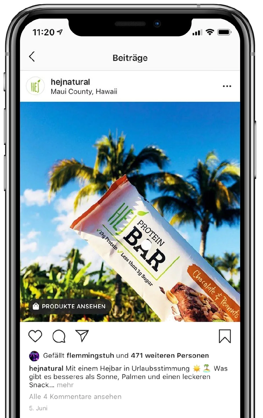
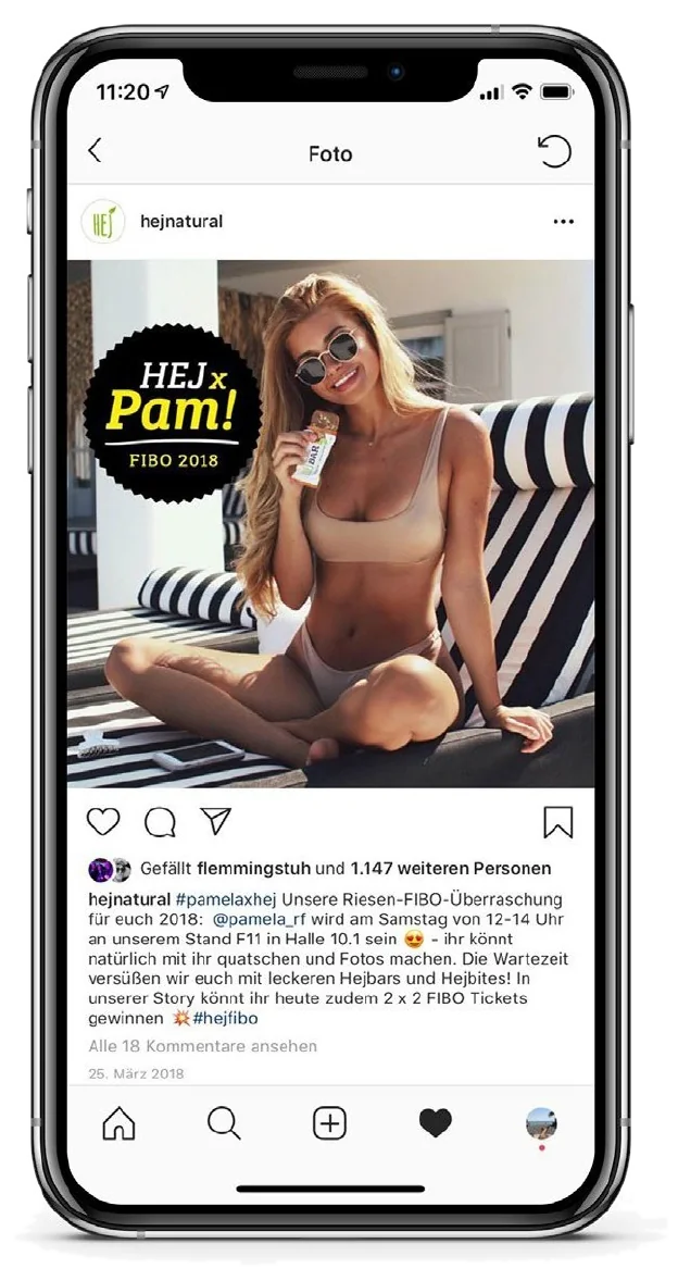
Content strategy for millennial consumers, with influencer collaborations and one visual language across product, lifestyle and event content.
Brand identity and packaging
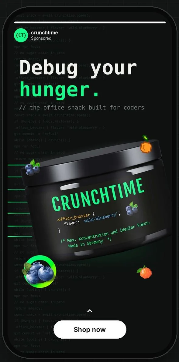
An everyday office snack for coders. The identity speaks their language: CSS syntax on the label, a monospaced typeface and 8-bit pixel icons as flavour codes.
// the office snack built for coders
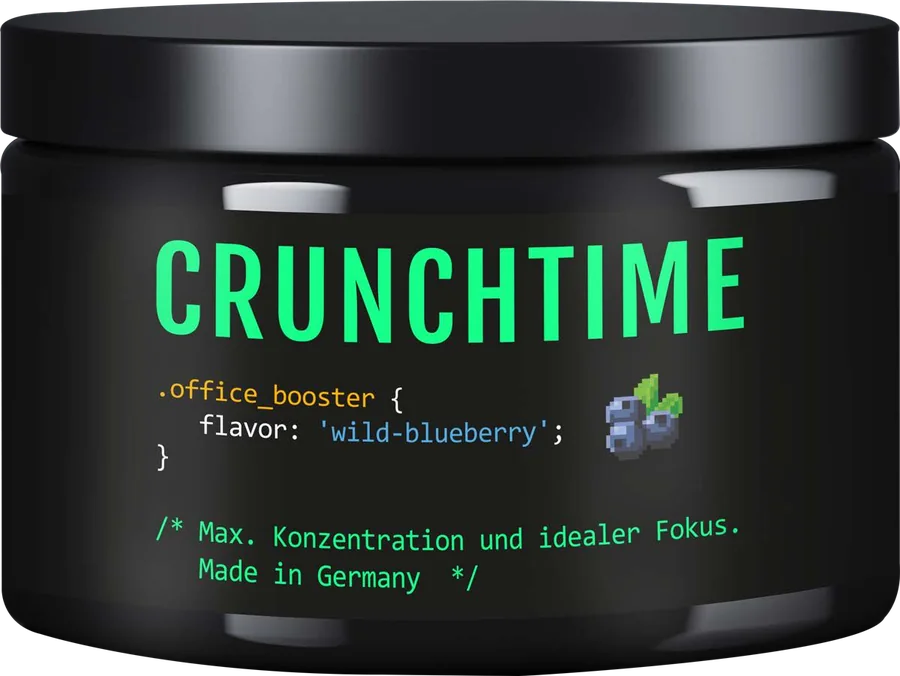
.office_booster {
  flavor: 'wild-blueberry';
}
/* why coders love it */
Brand, packaging and product
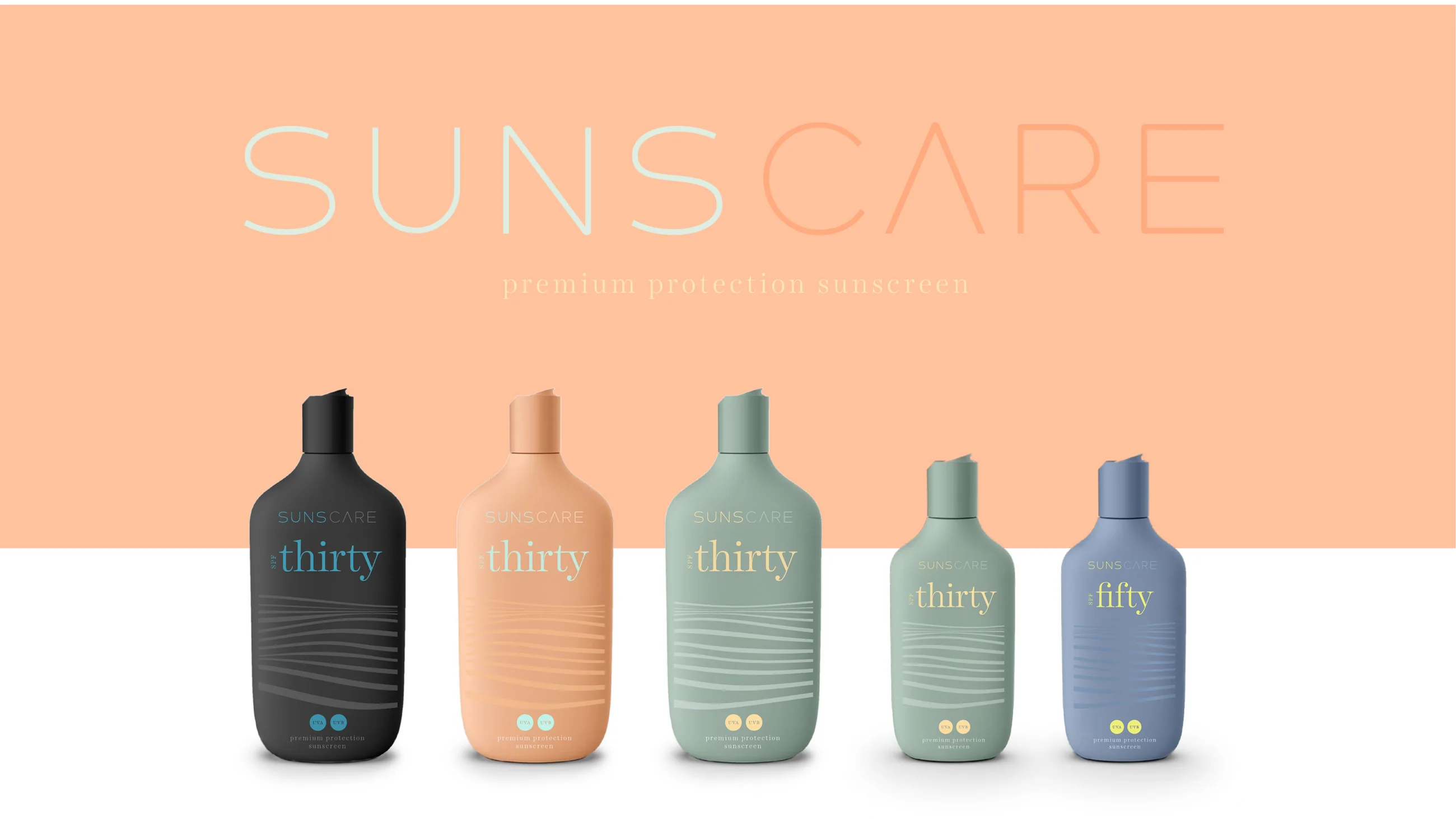
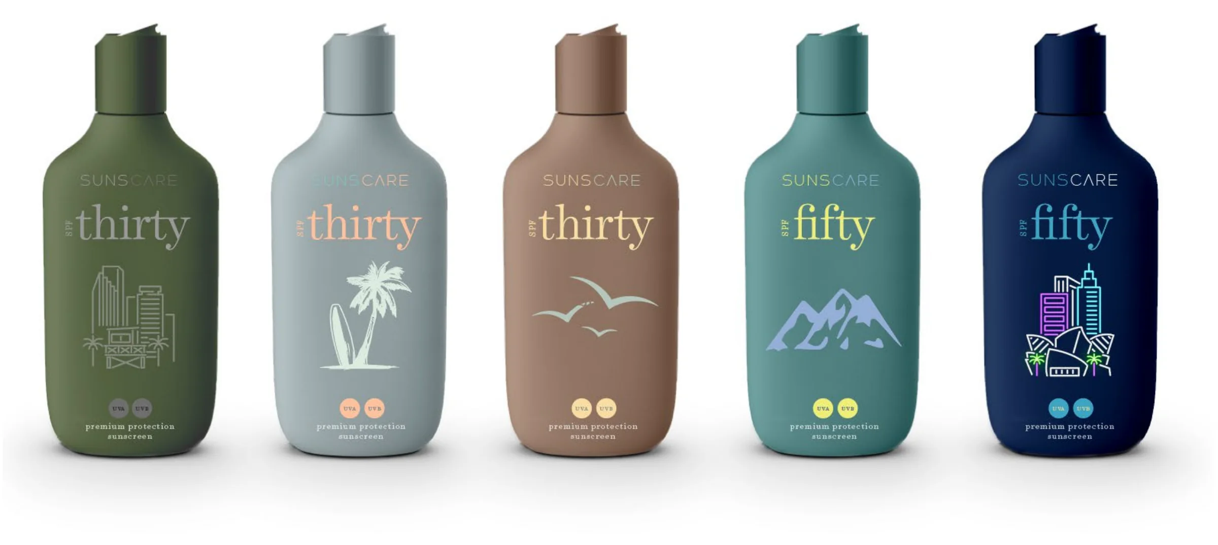
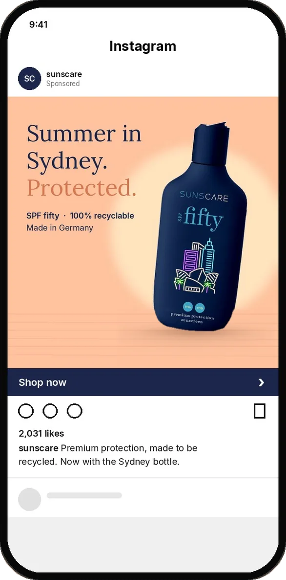
A premium sunscreen made in Germany, in 100% recyclable Green PE and FSC-certified materials. Registered with the DPMA.
Let's work together
I take brands from the first sketch to the shelf, and to the feed. Tell me what you are building.
Editorial · Graphic Designer, 2012–2013
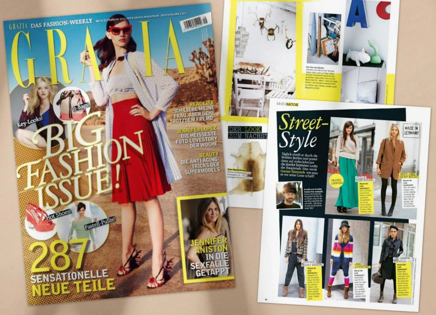
Layouts and illustrations for the weekly fashion and lifestyle magazine, plus support for its German relaunch. Daily typography, grids and image hierarchy on tight weekly deadlines.
AI-focused version
This link shows my visual AI work first. The full portfolio covers 13 years of brand, packaging and data visualisation.
What I do
How I work
Six criteria on a 1–5 scale turn “I like it” into feedback a team can act on, like the AG1 key visual rising from 2.2 to 3.0.
See the evidence 02At Deloitte and Porsche I review dashboards widget by widget with developers and coach users worldwide, so designs survive implementation.
See the evidence 03User interviews and an audit came before every EnBW redesign. The result: 25% higher dashboard usage.
See the evidence 04At HEJ Natural I hired, trained and led a team of 4–8 plus external agencies, from launch to 70+ products in three years.
See the evidenceIndustry experience
From luxury cars to protein bars: I have designed for regulated corporates, fast-moving consumer brands and early-stage start-ups, in Germany, the US, Australia and New Zealand.
Sales and marketing dashboards, styleguides and e-mobility brands.
Energy-trading dashboards, UI/UX audit and user research.
Brand building, packaging systems, range architecture and relaunches.
Supplements, sun care, fitness and retreat concepts.
KPI and merchandising dashboards, web shops and platform relaunches.
GenAI and data products, Power BI design systems and client delivery.
Editorial design, magazine relaunch and a media-group platform.
Product design, brand and UI/UX for software and blockchain start-ups.
Pro bono brand, website and mentoring.
Tech stack & languages
Charity
Pro bono brand and UI/UX work for organisations I believe in.
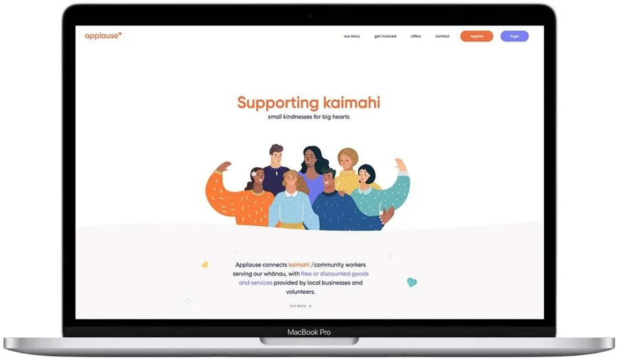
A charitable trust that connects kaimahi, community workers serving their whānau, with free or discounted goods and services from local businesses and volunteers. I joined as volunteer brand manager and design mentor during the first lockdown.
“Julius is absolutely brilliant! He is our brand manager and has expertly completed a suite of collateral in just six months.”
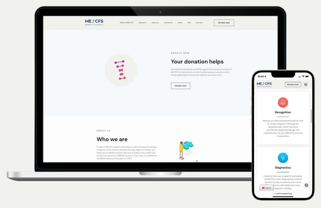
Since 2022 the foundation has promoted and funded biomedical research into ME/CFS and Long COVID, advised by an international scientific board. I support the team of patients, relatives and volunteers with my design work.
Career at a glance
Design direction for GenAI and data products, from user research to validated UI/UX concepts, structured design reviews and stakeholder workshops.
Running my own studio work and ventures alongside client projects, often in parallel.
Built HEJ Natural end to end, from launch to 70+ products in 5,000+ locations within three years; part of the leadership team.
Relaunched corporate identity and web design; led the design team and art direction for TV commercials.
Packaging relaunches for Coca-Cola, Carlsberg and Henkel.
Editorial layouts, illustrations and the relaunch for the German market.
Beyond design: a nature-loving person who enjoys surfing, arts, discovering cultures and learning new languages.
12 voices from LinkedIn and references.
“Julius impressed with his creativity, expertise and communication skills. He worked closely with business departments and the developers to create good-looking and user-friendly visualizations that met the requirements and expectations. Julius is reliable and professional.”
“Julius is a highly creative, independent and overall fantastic UX/UI designer and a real benefit to my team. He is always communicative, open for feedback and able to express his ideas in a comprehensible way.”
“Worked with Julius a couple of times and need to say: He is visionary, extremely professional, super ambitious and never loses joy while working. A truly inspiring and focused character with a playful easiness to bring his ideas to paper.”
“Highly skilled creative director, passionate about branding, lots of experience working in different industries including food, fashion, software, furniture and more. Couldn't recommend Julius more.”
“It was always a pleasure to work with Julius. His designs and concepts were always convincing and followed a holistic approach, which considered both the user perspective and the business side.”
“This guy really is inspiring! A fresh mind with a fresh visual style. As a colleague, he is someone that you could always rely on. As a client, he's the one to hire. Gets your job done and makes it seem effortless.”
“Creativity is Julius' great passion that shows in everything he does. He also has an extraordinary talent for creating a working environment that makes people happy and productive.”
“Absoluter Experte in seinem Bereich. Seine Resultate haben meine Vorstellungen jedes Mal übertroffen. Ganz klare Empfehlung für jeden, der sich nur mit der qualitativ hochwertigsten Lösung zufriedengibt.”
“We valued him as an excellent and extremely committed manager. He actively promoted cooperation, informed and supported his employees comprehensively at all times.”
“Mr Kahlbrandt has an excellent and in-depth knowledge of the field, which he always knew how to implement in a highly profitable way for our company.”
“Mr Kahlbrandt was at all times ready to take on responsibility, even with difficult tasks, and brought his work with skill and energy to a successful completion.”
“Julius is absolutely brilliant! He is our brand manager and has expertly completed a suite of collateral in just six months. Julius is professional, thorough, and talented.”
Collaboration
I am always happy to talk about brand, data visualisation and AI design.
Open to conversations
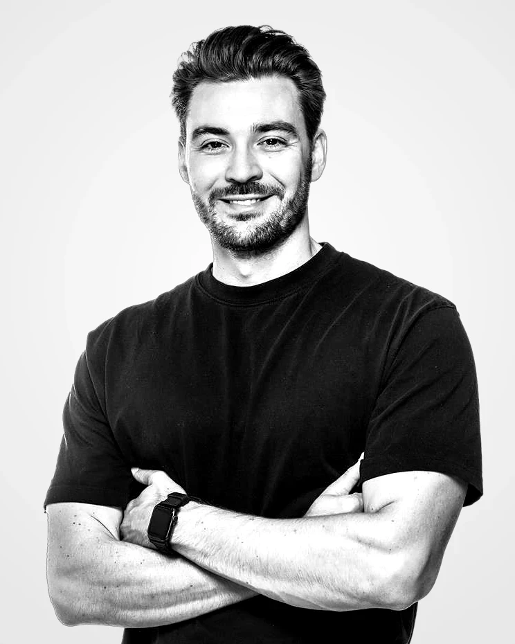
Julius Kahlbrandt
Creative Director · Hamburg